The Trump Economy
Plus more white nationalism from the administration.

As a general matter, it is clearly the case that Presidents get too much credit and too much blame for economic outcomes. On balance, the forces that drive the economy are simply outside the control of the occupant of the White House, although voters tend not to see it that way.
On occasion, however, policy choices can matter, for good or ill. In the case of the current administration, I have no problem stating that its approach to the global economic system via the erratic tariff policies of the president has been a net negative. If you are going to disrupt the decades-old global economic order, there are going to be consequences. Further, when looking at things like employment, it is hard to ignore that this administration has destroyed roughly 168,000 federal jobs just since September, and the damage to many federal functions has had negative impacts on private sector jobs as well.
As such, if we look at the monthly job numbers, it is objectively impossible for Trump and his supporters to claim that his administration is doing a good job for America.
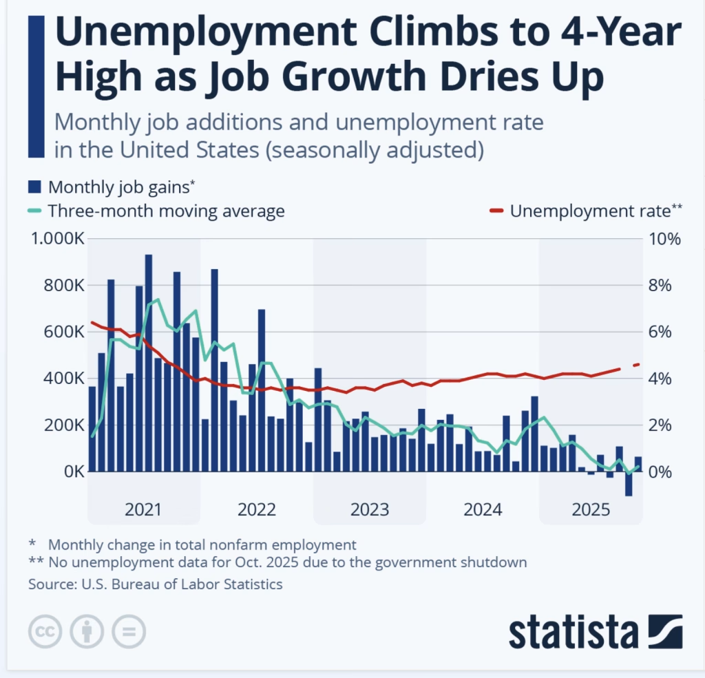
Here are the basics of the most recent data releases via PBS: The U.S. gained 64,000 jobs in November but lost 105,000 in October as the unemployment rate rose to 4.6%.
The United States gained a decent 64,000 jobs in November but lost 105,000 in October as federal workers departed after cutbacks by the Trump administration, the government said in delayed reports.
The unemployment rate rose to 4.6%, highest since 2021.
[UPDATE: section removed as per discussion below]
And yet, the propagandists in the administration (this is the accurate designation), state the following:
“The strong jobs report shows how President Trump is fixing the damage caused by Joe Biden and creating a strong, America First economy in record time. Since President Trump took office, 100% of the job growth has come in the private sector and among native-born Americans — exactly where it should be. Workers’ wages are rising, prices are falling, trillions of dollars in investments are pouring into our country, and the American economy is primed to boom in 2026.”
— White House Press Secretary Karoline Leavitt
From that linked report, we get the following as well:
Since September, the private sector has gained 121,000 jobs, while the federal government has shed 168,000 jobs as the Trump Administration shrinks the runaway federal bureaucracy.
In the simplistic terms provided, that’s a net loss of jobs of -47,000.
The same press release notes that federal employment is down 217,000 jobs since Trump took office, and for some reason, job gains since August were a sub-bullet to the September numbers. It is all a confusing presentation of data, to be honest.
There is, of course, a nativist, white nationalist spin to it all: “Under President Trump, 100% of the job growth has come in the private sector and among native-born Americans — NOT illegals.”
By the way, contrasting “native-born” with “illegals” ignores that there are plenty of foreign-born persons in the US, who are here legally, if not citizens. This rhetorical focus on “native-born” of late seems to have picked up recently and bears our attention.
Indeed, Stephen Miller took to X to spew lies about past jobs data, suggesting that all past job growth was just Americans being replaced. It doesn’t make any sense, save as gross white nationalist propaganda, and seems to endorse a version of Replacement Theory.
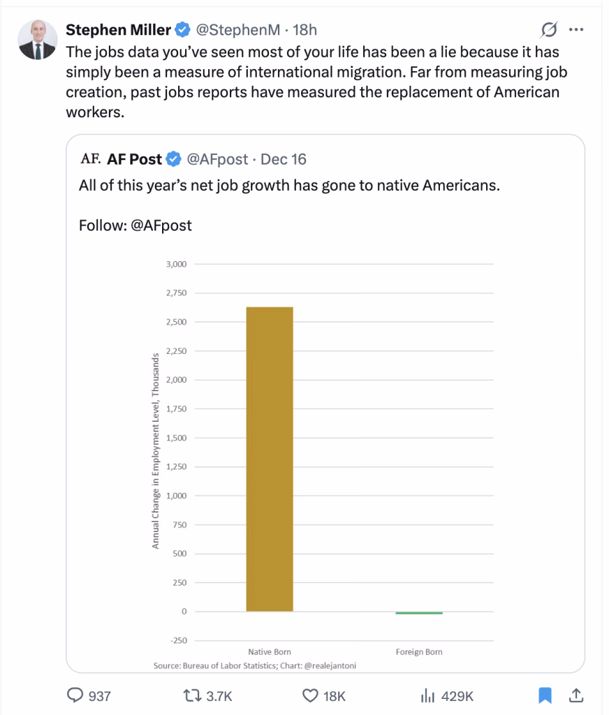
For more on these data, see Jeremy Horpedahl, Job Market Data is Back! Did All Job Growth Go to Native-Born Americans in the Private Sector?
I recommend the whole post, but would note the following:
687,000 private-sector jobs is not exactly robust job growth. A year ago the comparable number was running around 1.2 million jobs for a similar timeframe, so private-sector job growth has been cut in half. Positive growth, but weak by recent standards.
“native Americans”, huh?
Speaking of great replacement . . .
Who you gonna believe, deep state data or your lying administration?
With Trump’s approval on the economy IIRC 36%, apparently people are believing grocery prices.
The FRED graph looks like a downward arrow since the start of the graph, with a bump around the beginning of the Trump administration. The source link being just a Twitter post with that graph, rather than anything adjustable to see trend lines going back further, does nothing to make me think this isn’t someone abusing graphs to reach their preconceived conception.
Looking up FRED, I think the source is here:
https://fred.stlouisfed.org/series/MANEMP
And a 5 year view shows that after the pandemic recovery peak in late 2022, it’s just been a slow, wobbly decline.
(A longer view shows that George W. Bush oversaw a massive decline, that was halted by Obama, with a gentle upwards trend that is sliding down again, like someone tossed a ball. And some truly spectacular downward spikes for recessions, but that George W. Bush decline was when the economy was doing “good” — I wonder what Bush was up to)
Kind of amazing how little effect the tariffs have had, if we trust the Federal Reserve numbers. Given this administration, and how the numbers were late, etc… I don’t fully trust them.
I think that graph is just data abuse.
Meanwhile, you can play with the time period on total nonfarm employees, and see the hiring sputtering to a halt.
https://fred.stlouisfed.org/series/PAYEMS
This makes the data abuse of the previous graph more offensive, since they just had to find a different graph from the same source, and it would tell a similar story to what they wanted. Sigh.
They could have at least adjusted the dates on the quoted graph to start at the inauguration, so the overall trend wasn’t so apparent. And then it looks flat until the tariffs and a sudden decline. I just want better misleading graphs — is that too much to ask for?
It’s no longer enough to cry “fake news” and claim today’s data is wrong or doesn’t give enough credit for all that is good. Instead, all past jobs data was the lie and everything we’d been led to believe about what is good about American Prosperity’s availability to citizenry is disqualified because it counted black, brown, and yellow people.
And if that doesn’t make sense to you, then you’re the radical and you hate America.
I recommend today’s Krugman’s substack
He goes into the more recent numbers and explains why they look “pre-recessionary.”
@Gustopher:
This kind of crap pokes me in the eye, too.
It’s like the c-nat misappropriation of the study about the most quoted authors and books of the founding era. I think I bellyached about it in a post a couple months ago.
Rather than quote the author when he wrote that Biblical influence should receive more scholarly attention, which would support multiple claims they are fond of making. Instead, they reproduce one chart and mischaracterize what it shows, and ignore the graphs that are inconvenient to their narrative.
It’s like they can’t help but make shit up.
What will they say when the “native born” (aka white people) can’t find work, and they can no longer blame “illegal” immigrants for taking them?
@Gustopher:
@Kurtz:
“The most perfidious way of harming a cause consists of defending it deliberately with bad
argumentsgraphs.”@Gustopher: Thanks for pointing that out. I have removed that from the point. It was largely superfluous in any event.
I will blame the COVID (mild case, but sucks nonetheless)–although actually I was just lazy and should known better.
@Mimai:
I agree with Nietzsche on that.
But his milieu and audience was a little different from what we are facing today.