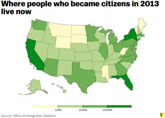
Where New Americans Are Coming From, And Where They Live
Last year, there were 779,829 immigrants who became U.S. citizens according to the Federal Government.
Dara Lind at Vox took the data and created this map showing where those people came from:
Not surprisingly, Mexico is at the top of the list, with India, China, and the Phillipines also providing large numbers. Interestingly, smaller nations such as the Dominican Republic, Cuba, and Haiti were also a big source of new citizens. And not one of the nations in the top twenty was European.
As for where these new citizens live, it’s probably not surprising that most of them live in the same states where many Americans have moved in recent decades, although New York and New Jersey also took in their fair share:
Every state got some new citizens, even Wyoming which is at the bottom of the list with 242 new citizens.


Welcome new Citizens!
http://www.youtube.com/watch?v=EO8JSdqPIO4
I have complained about this before; sorry if I seem to be riding my hobbyhorse.
I don’t think that demographic data should be presented using a geographic area map. People matter; acres don’t. Montana does not have the same economic, social, or cultural impact as all of New England. Wyoming got 242 new citizens which about doubles their population.
I heartily agree with the welcome to these people. Let’s all strive to fulfill America’s promise.
A few years ago one of my daughters lived in Senegal for a few months. Senegal is a stable country; she lived with a French-speaking Muslim family and traveled throughout the country.
She said that it appeared to her that there were thousands of Senegalese, especially in Dakar, who were biding their time and
hoping to emigrate to the United States or to France.
These are people who want a better life, a life that is different that the one they are living right now. They are everywhere around the world.
Our state has a large Bosnian/Croatian/Serbia refugee population.
We have had several friends become citizens the last couple of years.
Once again a map that might convey the wrong impression. The number of Mexican-Americans who were naturalized last year is greater than the number of the two next largest national contingents (India and Philippines) put together. The map does not convey that.
Our relationship with Mexico is sui generis.
@Dave Schuler:
Eventally the U.S. and Mexico will have what Luis Guiteerz wants: free movement between the two countries. The only problem then is that the quality of life in both countries will be the same.
Am I misreading this map, or does it say that somewhere between 11 and 100 new citizens were from the United State of America? Huh?
In fact, I don’t see any countries in the “0 to 10” (0 to 9?) category. Not even North Korea. That strikes me as… unlikely. I think they botched the color scale.
Which means we clearly need to improve our marketing in Norway and Cameroon.
@Slugger: Depends on what you hope to get from the demographic data, or what it’s being used for. In this case, I think it is useful to know where, numerically, the immigrants are going regardless of the local population. They’re not going to Montana, so Montana is light-colored. The native population not factoring into the relevance there.
If I were doing a map that intended to show something about the immigrant population in relation to the total population, for example, then I would factor in the latter.
From the linked article:
Could be why USCon Amendment 14 states:
Just a guess…
@Dave Schuler:
And that would also give the wrong impression, I would instead argue for a map showing per capita naturalization.
India – 4.0/100,000. (147th place)
China – 2.6/100,000. (162nd place)
Mexico – 83.0/100.000. (34th place)
Some countries with a higher per capita naturalization than Mexico:
Jamaica – 604.9/100.000 (5th place)
Trinidad and Tobago – 435.5/100.000 (10th place)
Dominican Republic – 419.2/100.000 (12th place)
El Salvador – 290.2/100.000 (15th place)
Cuba – 273.0/100.000 (17th place)
Haiti – 225.5/100.000 (19th place)
Albania – 125.4/100.000 (25th place)
Armenia – 106.2/100.000 (29th place)
at the top:
Montserrat 1320.6/100.000.
and at the bottom (not counting those listed as having been born in the United States):
North Korea 0.1/100,000.
And for anyone wanting the full data, not just the summary of top 20, it can be found here.
@ernieyeball: Thanks for the explanation — but that doesn’t cover how we got > 10 from North Korea, and (as far as I can tell) every other country on earth that is large enough to be visible on the map… That’s amazing.
@PJ:
As is typical of analyses of that sort, very small populations and very large populations produce anomalous results.
@PJ: I don’t think native population is a particularly useful metric here unless we are specifically interested in our immigration popularity of a particular country. To me, it’s more interesting to know how many of our newly naturalized citizens came from China than it is what percentage of their population left there for here.)
I think raw numbers are probably the most appropriate thing (and that @Dave Schuler is right that the colors should be recalibrated.