Ideology Everywhere
Even in font selection, it would seem.
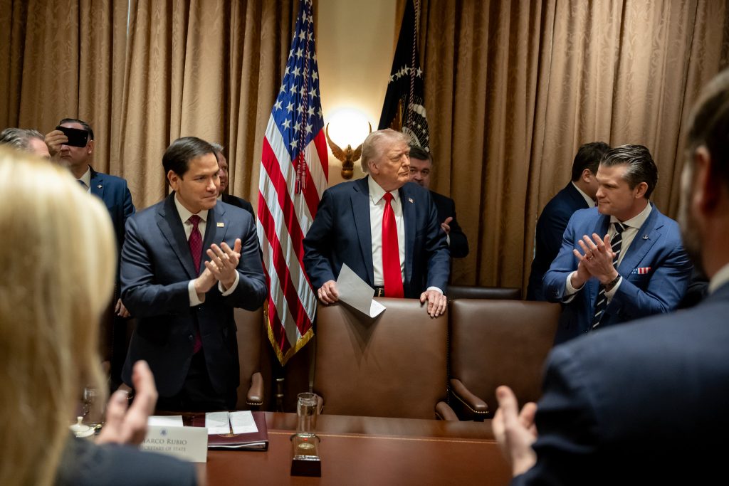
Via Reuters: Rubio stages font coup: Times New Roman ousts Calibri.
The department under Blinken in early January 2023 had switched to Calibri, a modern sans-serif font, saying this was a more accessible font for people with disabilities because it did not have the decorative angular features and was the default in Microsoft products.
[…]
A cable dated December 9 sent to all U.S. diplomatic posts said that typography shapes the professionalism of an official document and Calibri is informal compared to serif typefaces.
“To restore decorum and professionalism to the Department’s written work products and abolish yet another wasteful DEIA program, the Department is returning to Times New Roman as its standard typeface,” the cable said.
This is, of course, an insanely minor matter. But I think it is worth noting the way any hint of diversity or mildly compassionate choices from the past have to be denigrated. How was it “wasteful” to have been using the default font in Word? Granted, the latest update shifted the default to Aptos, so maybe that is why no one noticed. Indeed, from an efficiency point of view, is not making everyone take the time to use any font other than the default a waste of time?
I just find the need to make things like font selection somehow an ideological issue to be telling about this administration, to include Rubio’s need to fit into that mold, as he clearly looks towards a 2028 run. Can’t let J.D. have the anti-woke lane all to himself, I guess.
And let me stress: the “wasteful DEIA” aspect of this was making it more readable for people with certain visual impairments and certain learning disabilities. I mean, making a costless move to maybe help someone? Can’t have that!
I will acknowledge again: insanely minor, but it says something about these people that they have to make even the insanely minor into ideologically-driven tiny cruelties if they can.
You know, it would have been possible to just say that they like Times New Roman better than Calibri (as do I) or that they are old people who are used to the older font (which likely describes me as well). No need to say they are taking away something, at least in part, because it might be helping someone.
It’s performative and keeps them in the headlines for something other than murdering people on the high seas, or Epstein, or the massive job losses and affordability crisis.
Also, as a bonus, the cruelty is the point.
These are such sad, small people. I hope they are all unemployable after this administration finally ends.
You know what I find ironic about all this? For decades there’s been this trope in popular culture of people who see racism everywhere to the most absurd degree imaginable (e.g. the scene from Bowfinger where Eddie Murphy counts the number of K’s in a movie script and claims the total is divisible by 3, and even that’s wrong). But you need to realize, whatever Rubio’s motivations he is playing to an audience with absolutely zero self-awareness, who will never notice the irony that they’ve become exactly like the caricature they have of the other side.
My memory from DoD is that we went to Calibri because it used less ink while printing, not some DEI BS.
So we add “Font Master” to Rubio’s always increasing portfolio. Let’s see…the Secretary of State, Acting National Security Advisor, Archivist of the U.S., and head of USAID has time to fret about the State Department’s *official* font. Who knew Calibri was woke, and Times New Roman was not?
Default font for the current administration should be Wingdings. Unserious goofs. Is there any larger sycophant in this administration than Rubio. He is like a chameleon jellyfish, he just floats around with no spine, you don’t see him, then he just appears and latches his tentacles on to something.
Two thin themes of Trump himself is an obsession with formality/aesthetics and a desire to own the libs at any cost. But, I must admit, this is the first I’d heard of helping the visually impaired as part of the woke agenda.
@James Joyner:
There’s been a low intensity but incessant railing against the Americans with Disabilities Act for decades.
Keep in mind for many wingnuts, El Taco most emphatically included, a great many disabilities qualify as insults.
The guiding principle is totalitarianism not partialism. No detail is outside the purview of our Trump. Entering tourists are going to be required to reveal five years of social media participation. Fonts, social media, charitable donations, it all matters to our leader.
@Jc: “Default font for the current administration should be Wingdings.”
I was thinking Comic Sans.
@wr: Over at NRO’s “The Corner” they make the same joke but about Blinken and Biden. Seems more apt your way.
BTW, the relevant part of the Great Font Wars is that El Taco is all over the Epstein files.
Why should the font be new Roman? Ancient Roman font as found on many older public buildings would match the classical beauty of the president’s preferred architectural style. It added impressive dignity to official government publications in Germany last century, especially the very successful Third Reich. Morris Roman, designed by William Morris in 1893, would really make the State Department’s documents stand out.
@Ken_L: This sent me down a rabbit hole to discover the Antiqua-Fraktur dispute.
If they don’t want to be called Nazis …