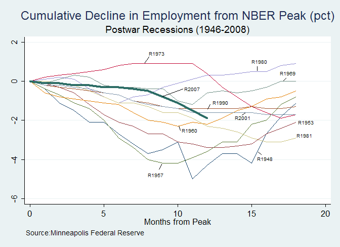
In this post I linked to a graph that was designed to provide some context for the current recession in terms of past recessions. However, Alex Tabarrok has posted an update entry noting that the Minneapolis Fed’s graph for Mild, Median and Harsh recessions were actually “Frankenstein” graphs. As a result Alex has posted a graph of all recessions along with the current recession data so far. I thought I’d post the graph here as well since a number of commenters seemed interested in that post.

To see the image in a higher resolution, click on the image.
Based on this new information the current recession is looking similar, at least in terms of unemployment like 1981. The 1981 and the 1973 recessions are the longest post war each at 16 months.