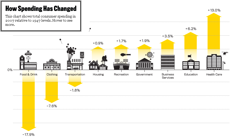
A piece by Stephen J. Rose in The Atlantic titled “How We Spend” includes this infographic:

The version at the site is interactive but the snapshot is interesting. At the apex of the last economic boom, we were spending far less as a percentage of our income on food, clothing, and transportation than our predecessors of half a century before, with the surplus going mostly to education and health care. That’s not particularly surprising. This, perhaps, is:
If we drill down further—to see not just the categories we spend on but where our dollars go within those categories—the picture is even more dramatic. Taking 1967 as our starting point, 30% of the cost of the things we consumed that year went to manufacturing them; by 2007, that figure had fallen to 16%. In contrast, what we spent on business services over the same period jumped from 12% to 26%. That’s because baked into the price of everything we buy is the rising cost of advertising, accounting, legal services, insurance, real estate, consulting, and the like—jobs performed by the high-wage workers of our modern economy. These days, 52% of all compensation goes to office workers. That includes the manufacturing sector: nearly a third of workers aren’t on the factory floor; they’re behind desks.
Interesting.