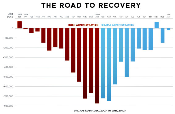
Yesterday, I explained why this Obama chart purporting to show that the stimulus created a lot of jobs was misleading:

Today, Pollster.com’s Charles Franklin displays the chart’s information in a different way to point to an even more glaring problem:

The OfA chart gives the impression that we have “returned” to where we were in January 2008. The sharp rise since February 2009 gives the impression that what was lost in red has now been regained in blue. But of course, that isn’t right. The rate of loss has indeed slowed tremendously in the first year of the Obama administration, something the White House has every right to crow about. But that doesn’t mean we’ve returned to previous employment levels. In fact, we’ve continued to sink lower throughout the last year, just at a slower and slower rate.This second chart makes that perspective on the data more clear. It is visually clear, if less dramatic than for OfA’s chart, that the rate of job loss has slowed. But my version of the chart drives home the point that we have continued to lose jobs and now stand at over 8 million jobs lost since December of 2007. That is the other “deficit” the administration must worry about. The recovery, which GDP data show has started and at 5.7% growth in the 4th quarter is quite strong, will take a very long time to regain these lost jobs. This fact is made clear in my chart, while it is obscured in the OfA presentation.Interestingly, my chart is also subtly deceptive. More jobs were lost in the last Bush year than were lost in the first Obama year. But the red lines look shorter and smaller than the blue Obama lines. That makes the graph appear to show that things are worse for Obama, even though his job losses are actually about 3 million compared to Bush’s 5 million.
Of course, Obama took over near the end of recession whereas Bush was in power during the worst of it. And, no, I don’t think Bush is significantly responsible for the global recession that took place under his watch nor do I think Obama’s fundamentally responsible for the jobs that were lost once he took over — much less those that weren’t.
But it’s interesting to see how the perceptions of data can be manipulated with clever graphics.