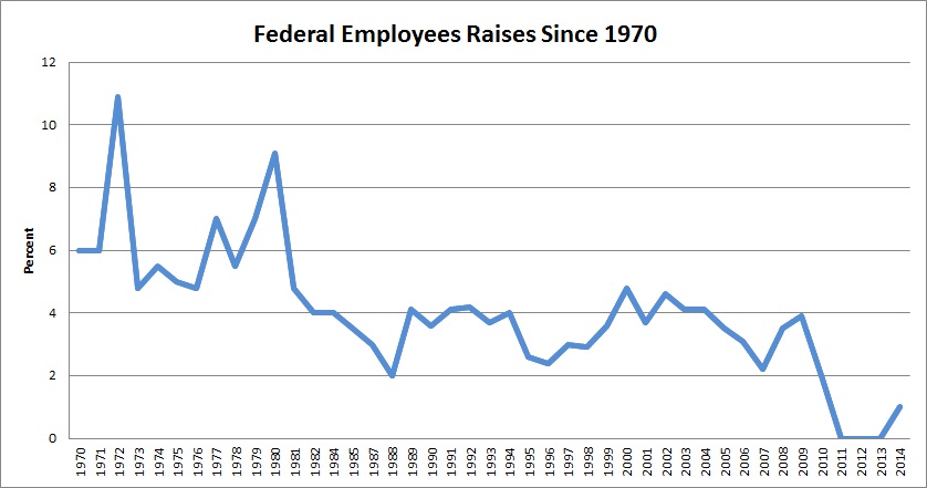
Eric Katz of Government Executive points to “The Incredible Shrinking Pay Raise in One Chart.”
Earlier this week, President Obama announced that he will propose a 1 percent raise for federal employees in 2015.
If adopted by Congress, the raise would mark the second consecutive 1 percent increase after three years of frozen pay. Federal employee groups were not impressed, calling the proposal “pitiful,” “inadequate” and “bittersweet.”
Turns out the groups may have a point, at least from a historical perspective.
Here’s the chart:

That’s the entirety of Katz’ analysis. Regular readers know what comes next. The chart without a doubt shows a shrinking pay raise. But . . . so what? What’s interesting is how each year’s pay compares to the cost of living. I’m not going to go through the effort of compiling a 1970 to 2014 inflation graph and then plotting the federal pay raise data against it. But here’s a chart with the CPI since 1957:

You’ll notice that the peaks and valleys roughly correspond to the federal pay raises. Raises were very high in the 1970s and early 1980s because of sky-high inflation; they’ve been much lower since because there’s been next to no inflation. Owing to the Great Recession, we actually had negative inflation in 2009. Federal employees nonetheless got a pay raise in 2010.
Now, President Obama ordered and Congress went along with a pay freeze for 2011, 2012, and 2013. Given inflation rates of 3.2, 2.1, and 1.5 those years, that amounted to a real cut in pay. And, of course, 2013 was also the year of sequester-mandated furloughs. While those came with additional time off, those, too, amounted to pay cuts. But the chart really doesn’t tell that story.
For that matter, inflation isn’t the only thing to which federal civil service pay (which is actually what the graph looks at) could usefully be compared. If Congress were giving itself pay increases while not giving it to the civil service, that would be interesting. Similarly, if Congress was giving hefty pay hikes to the uniformed military—and it was—during the same period as it was freezing civil service wages, that’s interesting. Indeed, military pay has gone up at a much higher rate than civil service pay for years, such that Defense Department employees doing the same job and holding equivalent rank are taking home wildly different pay checks. For that matter, it would be interesting, if difficult, to compare civil service pay with equivalent private sector compensation over the same period.
But simply graphing pay raises over time with no context? Not the least bit interesting.