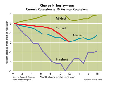
Alex Tabarrok Tyler Cowen posts some graphs from the Minneapolis Federal Reserve Bank that can help put the economic “crisis” into perspective. The first looks at the percentage change in employment,

The next looks at output,

Based on these two graphs and given that we are 1 year into this recession it is not the catastrophe that many, including President-elect Obama, are claiming. This recession is shaping up, so far, to be typical to mild in terms of recessions when looking 10 of the last recessions since WWII. In fact, I think the only way to describe President-elect Obama’s statements is fear mongering. In looking at the Minneapolis Fed’s other graphs we see the following in regards to this recession:


Are things bad? Yes. Is it the end of the world? Absolutely not…at least not yet going by the data we have so far. The recessions in 1948, 1953, 1957, 1960 and 1981 were worse in terms of job losses 12 months into the recession. In terms of output all the recessions, 3 quarters in, were worse. In fact, after three quarters output being positive is an unusual event. Can we have some perspective on things? This is not the worst recession since the depression…at least not based on the data we have to date.