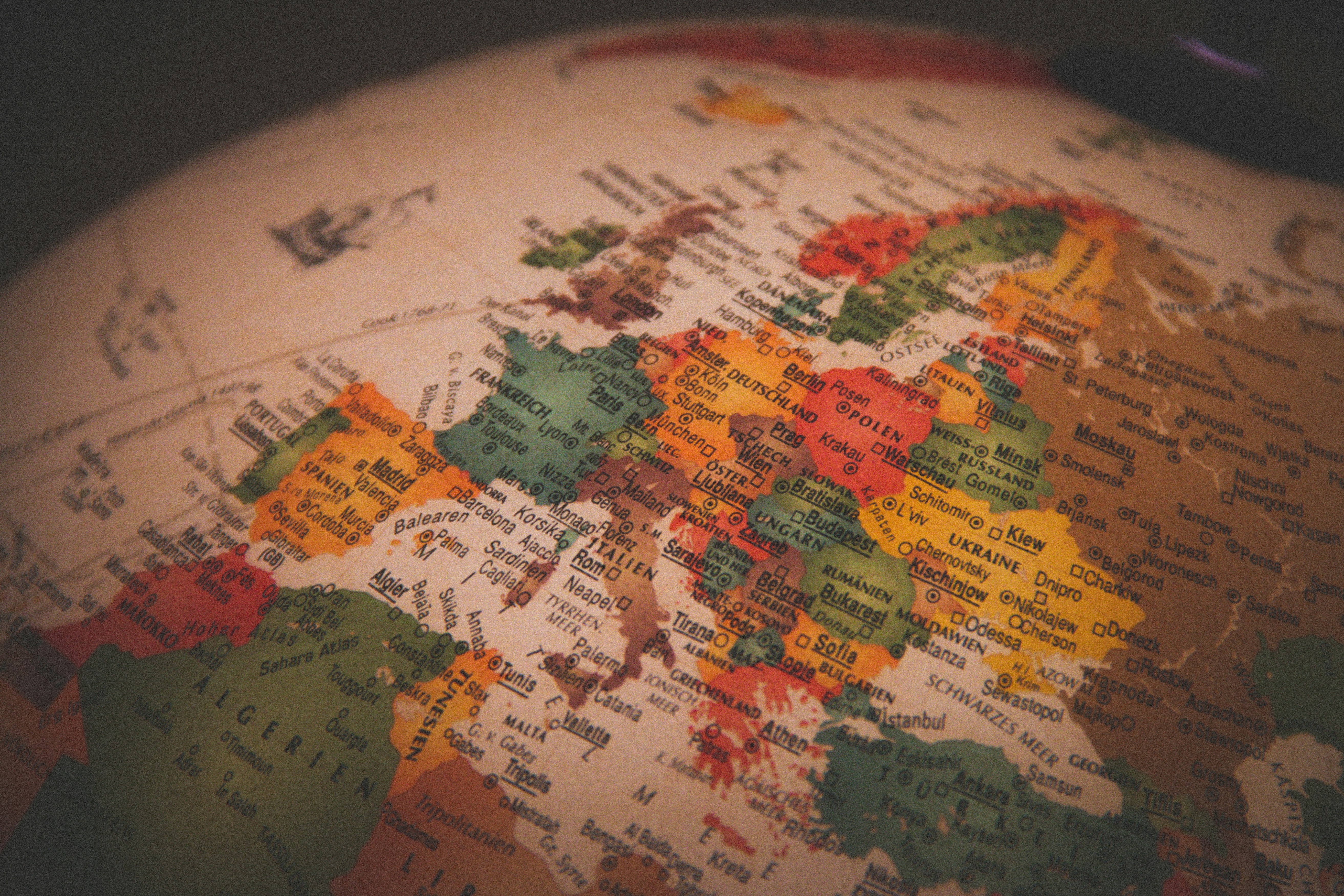
I noticed this headline at The Hill yesterday: The US only country to oppose a UN resolution correcting Africa’s size on world maps. Since I like maps, I knew that this was probably about which projection of the globe onto a flat surface was going to be used.
At any rate:
The U.S. was the only country to not support a United Nations resolution adjusting the appearance of Africa and other regions on world maps.
The body passed the “Correct the Map” initiative by a margin of 164 to one, with six nations abstaining from the vote.
The resolution, which was introduced by the West African country Togo, does not require the abandonment of the long-used Mercator projection. It instead encourages the use of equal-area projections that more accurately depict relative country sizes.
This is correct.
If you want a primer on the issue, the BBC provides: What different world maps get right – and what they get wrong.
The now widely used Mercator map was created in 1569 by Flemish cartographer Gerardus Mercator.
Its main purpose was to help European sailors navigate the oceans, as cartography Professor James Cheshire at University London College explained.
“He wanted a straight line to be drawn on a map to look like a straight line in reality if you followed a compass bearing,” he told the BBC. “That was what it was intended to do, and that’s what it does brilliantly well.”
To keep those angles correct on a flat map, Mercator had to stretch the grid lines wider as they moved away from the equator toward the poles.
His map accommodates for the curvature of the Earth by making countries near the equator seem much smaller than they are, with countries nearer the poles appearing stretched.
The distortion is a result of it being impossible to accurately represent the surface of a globe on a two-dimensional chart.
More than 450 years on, Mercator’s creation is still the basis for many of the maps we see in classrooms, on TV and online, including Google Maps.
All of this means that visual distortions are created, including making Africa and South America look smaller than they are and making Greenland look huge.
It is also true that a lot of maps end up centering the continents on the map in a way that very much shifts the visual focus far more to the Northern Hemisphere, instead of on the equator. For example, this version from the BBC piece:

Really, no projection of a globe onto a flat surface will be perfect. Nonetheless, it is hardly surprising that African countries, in particular, feel slighted by the Mercator projection when used in political contexts. It is a visual reminder of European dominance in particular.
Here’s a comparison from the Seattle Times:

The US was the sole vote against. The official explanation is here. My favorite part is that we objected to promoting “cognitive justice.”
I find this amusing because there is zero doubt in my mind that we voted against this map because it makes the US look smaller, and that hits a certain someone right in the cognitives.
Moreover, does anyone doubt that part of the reason that Trump wants Greenland is that the Mercator projection makes it look positively huge?
All of this reminds me of a map James Joyner shared here at OTB in 2014:

Gee, I wonder why the Mercator projection bothers them?
And anyone from Texas knows people care about these things, as it utterly irks folks in the Lone Star State that Alaska is the largest state! (Especially with the Mercator projection!!).