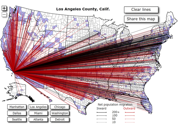
Regular commenter and erstwhile blogger at Sideways Mencken Michael Reynolds passes along a Forbes interactive map titled “Where Americans Are Moving.” It tracks IRS data for county-to-county moves for 2008.
Below is the graphic for Los Angeles County:
 Two things strike me as interesting here. First, the outward migration appears to be vastly outweighing the inward migration. Second, the outward flow is much more scattered than the inward flow. Both of those surprise me, given the incredible attractiveness of Southern California.
It appears that, in 2008 at least, most of the people moving to LA were doing so from the Boston-New York-Washington corridor whereas most leaving LA were staying either on the West Coast or somewhere else in the Sun Belt. I would have guessed that LA would be getting a much larger chunk of people from the Upper Midwest. Maybe the graphic is just overwhelmed by population clusters.
Update: Now with an actual link to the map!