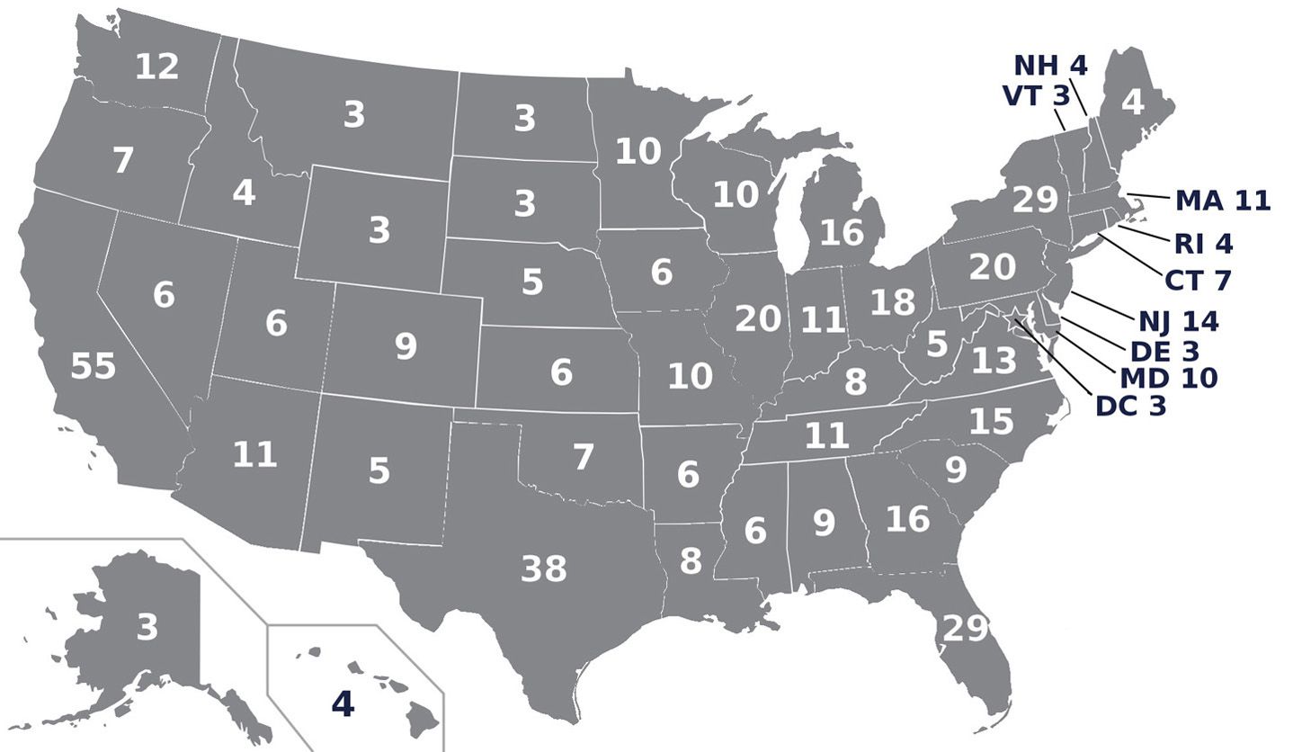

A comment on one of my posts inspired me to ask the following question: what narrative do these two maps suggest? More importantly: what do you think they tell you about the relative strength of the candidates and of the parties?


I mean, the top map is a blow-out, right? The top map shows a dominant party and genius candidate while the bottom map show sort of a meh situation.
But, what if I told you that the popular vote winner in the top map was 50.8% and the bottom map was 50.7%?
The top map shows the states Reagan won in 1980 (although due to reapportionment, his actual EV total was 489 to 49). The bottom map is what Biden’s final map may look like.
Both are winning maps. Both show national support of almost identical percentage. And, by the way, Reagan didn’t have the House with that map (he did have the Senate).
The main difference between the two maps is not what the majority of the voters wanted in those two elections. No, it was simply where that majority lived.