WSJ’s Market Watch presents this infographic of “the most and least expensive states to live in the U.S.“:

Aside from the fact, as the associated article spends its first several paragraphs admitting, that it’s monumentally stupid to consider DC, which is a tiny city, a state for the purposes of this comparison the chart massively overstates the disparities between top and bottom.
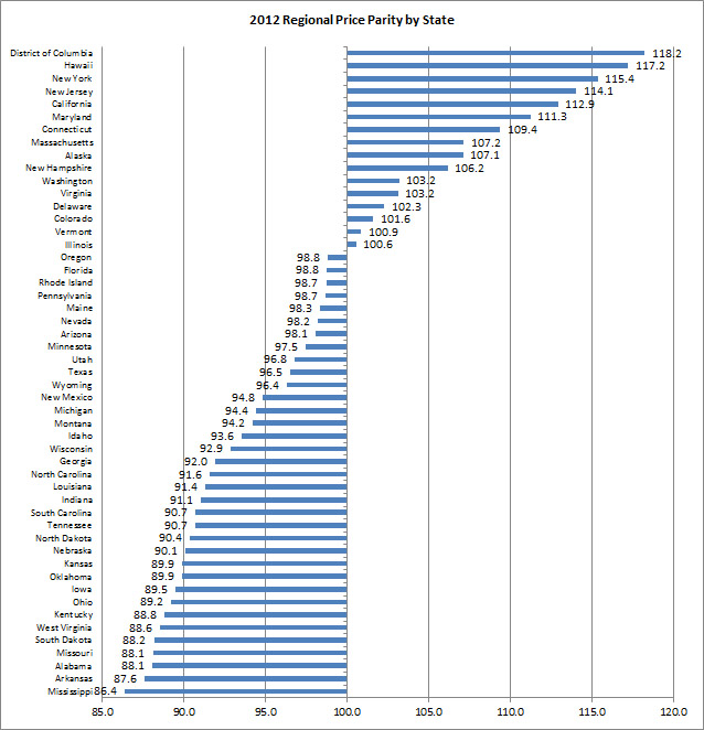
The top five states (outside of D.C.) were Hawaii, New York, New Jersey, California and Maryland, and the bottom five states were Mississippi, Arkansas, Alabama, Missouri and South Dakota. So, it costs 36% more to live in Hawaii than in Mississippi.
The spread between the cheapest state and the most expensive is a little over a third. But the chart makes it look like the difference between Burundi and Qatar.
Indeed, the price disparities across the United States are actually much, much less than I would have guessed. Even at the metropolitan area level, Honolulu, Hawaii, the most expensive in the country, is only 54% more expensive than Danville, Illinois, the least expensive.