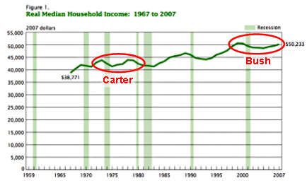
Kevin Drum reports that,
Bush expansion is over, and Brad DeLong describes it as “the first business cycle during which median household income in America falls from peak to peak.” And indeed it is. The closest we’ve come to such a dismal recovery in the postwar era was the dreaded stagflation-driven economic expansion of Jimmy Carter’s presidency.
DeLong provides a chart that Drum helpfully annotates with a red circle:

In both cases, the initial peak took place well before the president took office. In Carter’s case, the second peak was achieved and a new trough began during his tenure — which was only four years. In Bush’s case, household income has been trending steadily upward since 2003. Until the line starts trending down, we won’t know what the “peak” is.
It’s worth noting, too, that the chart is in increments of $5000. Even if we presume the 2007 numbers are the peak, we’re talking about what looks to be a difference of $500 a year. And, yes, these are inflation adjusted numbers.
Beyond that, while it’s a standard metric that makes sense for contemporaneous analysis of spending power, household income is rather dubious as a long-term comparative measure of the macroeconomy, let alone of presidential performance. During the 1970s and 1980s, we saw an explosion in the number of dual-income families. In recent years, we’ve seen a marked increase in single parent head of households.
That’s a huge factor, according to (2004) Census statistics:

Not surprisingly, households with two earners tend to have markedly higher incomes than those with one or, obviously, none. And that’s largely beyond the control of presidential management.