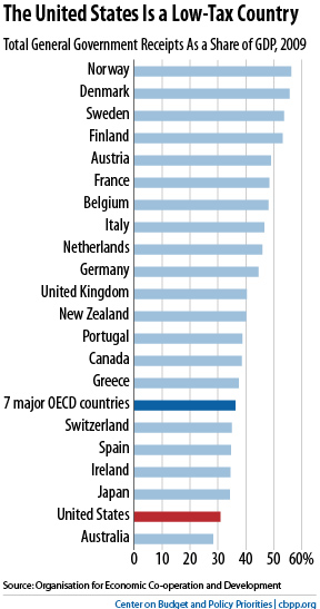
This chart from the Center on Budget and Policy Priorities is making the rounds:

Now, I don’t doubt the essential thrust of the chart. The United States is in fact a low tax country compared to the more socialistic states of the other developed economies. And, off the top of my head, around a third of the entire economy going to the government sounds about right.
But I wonder what, exactly, this is comparing. The chart is on a Flickr page and I couldn’t find any methodology for it on the CBPP’s website. It’s also on their blog, along with some other charts, but without any explanation on how it was compiled aside from the notation that it’s based on OECD data. Off the top of my head: Do these figures include state and local collections, or just those of the central government? Social Security and Medicare collections?
It’s also not clear that looking at taxes as a percentage of GNP is the most useful means of cross-national comparison.