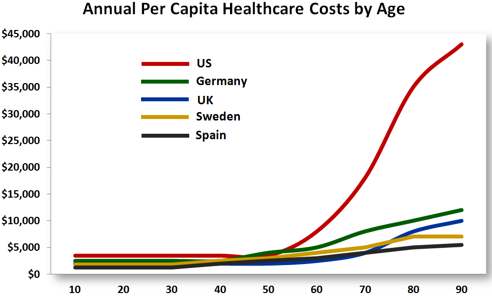

Yesterday in the comments of this post of Steven Taylor’s, “What’s Wrong With This Picture?”, I mentioned a bar chart comparing healthcare costs in a number of developed economies over at my place. Above, courtesy of a frequent commenter there and here, is an alternative representation of the information, sampled from an article at Forbes.
As you can see, one of these is not like the others and drastically so. There are multiple reasons the difference could be explained including
- For some unknown reason old people are sicker in the U. S. than elsewhere.
- Due to inadequate care earlier in life old people in the U. S. are sicker than elsewhere.
- Old people in OECD countries other than the U. S. don’t get the healthcare they need.
- The healthcare system in the U. S. is mobilized to potentialize the heavy subsidy we provide healthcare for old people.
I presume there are other explanations. I think it’s a combination of factors, leaning heavily to the second and last.
Whatever the underlying reason, it’s a graphic depiction of the point made in Steven’s post. What’s wrong with this picture?