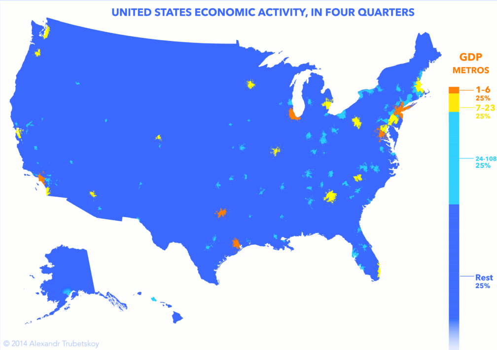
This graphic from February is making the rounds this morning:

It was the Pew Research Center‘s Chart of the Week (“How metro areas drive the U.S. economy“) eight months ago. Their explanation:
It probably should come as no surprise that most U.S. economic activity is concentrated in metropolitan areas. What may be surprising, and what the map above shows so clearly, is just how concentrated in a handful of big metros the U.S. economy is.
Reddit user Alexandr Trubetskoy based this map on metro-area GDP estimates by consulting firm IHS Global Insight (in a report prepared for the U.S. Conference of Mayors). Six metro areas — New York, Los Angeles, Chicago, Washington D.C., Dallas and Houston — account for almost a quarter of the nation’s $16.8 trillion economy; add in the next 17 highest-ranked metros, and you account for about half of all economic activity.
This is a revision of Trubetskoy’s original map, which showed a rather stark 50-50 GDP split but, he said, had some methodological and mapping issues. But no matter how you slice the data, U.S. metropolitan areas are economic powerhouses. In the report referred to above, IHS noted that the combined GDP of the nation’s 10 largest metros exceeds the combined output of 36 states; the New York metro area alone produced more than all of Spain.
At first glance, it’s rather shocking. Essentially, almost all of the geographic area of the United States produces as much wealth as a tiny handful of metropolitan areas. Actually, though, that’s not surprising, because the vast number of people live in a tiny handful of metropolitan areas. It’s a classic example of the phenomenon Randall Munroe illustrates here: